

TAKAHIRO TSUCHIDA
DESIGN COLUMN Vol.3
Milton Glaser - I ❤ NY
「I❤ NY」というグラフィックは、1977年にミルトン・グレイザーによってデザインされた。当時のニューヨークは、数々のアーティストを惹きつける世界で最も刺激的な都市である一方、市の財政は破綻し、治安が悪く、観光客には敬遠されていたようだ。そこでニューヨーク観光局は、この街のイメージを向上させようとキャンペーンを行う。そのためのロゴのデザイナーに指名されたのが、第一線で活躍していたニューヨーク在住のグラフィックデザイナー、グレイザーだった。彼はキャンペーンが数カ月で終わるものと考えていたといい、この仕事を無償で引き受けている。
そんな時代背景を思うと、この「I❤ NY」には、誰もが好む街ではないけれどそれでも私はニューヨークを愛している、というニュアンスがあったのかもしれない。「LOVE」を「❤ 」で、ニューヨークを「NY」で表現したちょっと暗号めいた表現も、この街に慣れ親しんだ人の声という感じがする。フォントにアメリカン・タイプライターを選んだのは、ニューヨークがビジネスの中心地だというイメージからだろう。シンプルであり無条件で楽観的な印象を与えるグラフィックに、ホームタウンを誇る気持ちがにじんでいる。
その後、ニューヨークは徐々に危険な街ではなくなり、明るく文化的なイメージが先行するようになった。グレイザーによるロゴが、その変化にどれくらい影響したかを計ることはできないが、住民や来訪者の心に、ロゴのイメージが刻まれていったのは確かだ。さらにグレイザーもニューヨーク観光局もおそらく想定していなかったのは、やがてありとあらゆる「I❤ ……」が世の中にあふれていったことだ。そのようなアイテムを世界中の観光地で見かけるし、ファッションブランドなどがモチーフに使うことも多い。今や世界で最もたくさん模倣されたグラフィックデザインのひとつだろう。
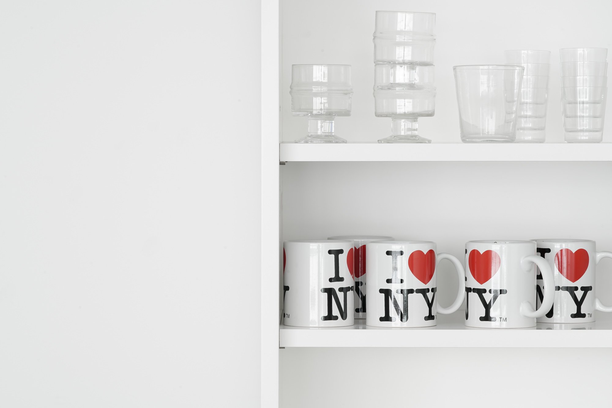
中国製のありふれた形のマグに、このロゴをプリントしたものは、ニューヨーク土産の定番といえる。歴史的なロングセラーに違いないが、通常はグッドデザインの範疇で語られにくい。どちらかというと、デザイナーの清水久和が提唱する「愛のバッドデザイン」にふさわしい。自分がこのマグの魅力に気づいたのはそれほど昔ではなく、2010年頃のミラノサローネで、家具ブランドのヴィトラが新作展示にスタイリングしているのを見た時だった。コンテンポラリーなデザインの家具の中に、プロップとしてスタイリングされていて、すっかり感化されてしまった。すぐ後にニューヨークに旅行した親類に買ってきてもらい、その後、初めて食卓で使った時の鮮やかな存在感が忘れられない。
土田貴宏 / ライター、デザインジャーナリスト
1970年北海道生まれ。2001年からフリーランスで活動。国内外での取材やリサーチをもとに、デザイン誌をはじめ各種媒体に寄稿している。
The "I ❤ NY" graphic was designed by Milton Glaser in 1977. At the time, New York was one of the most exciting cities in the world, attracting numerous artists, but the city was financially bankrupt, unsafe, and apparently shunned by tourists. Therefore, the New York Tourism Bureau launched a campaign to improve the city's image. The designer appointed for the logo was Glazer, a New York-based graphic designer who had been working at the forefront of the industry. He said he thought the campaign would be over in a few months and accepted the job free of charge.
Considering the background of the times, "I ❤ NY" may have had a nuance of "I love New York, even though it is not everyone's favorite city. The slightly cryptic expression of "LOVE" with "❤ " and "New York" with "NY" also sounds like the voice of a person who is familiar with this city. The choice of American typewriter for the font was probably based on the image of New York as a business center. The graphic, which is simple and gives an unconditionally optimistic impression, is imbued with a sense of pride in one's hometown.
Later, New York gradually became less dangerous, and a brighter, more cultured image prevailed. It is impossible to measure the impact of the Glazer logo on this change, but it is clear that the image of the logo has become etched in the minds of residents and visitors alike. What neither Glazer nor the NYC Convention and Visitors Bureau probably anticipated was that the world would soon be inundated with all manner of "I ❤ ......" items. Such items can be seen in tourist attractions all over the world and are often used as motifs by fashion brands. It is probably one of the most imitated graphic designs in the world today.
This logo printed on a common shaped mug made in China is a staple of New York souvenirs. It must be a long-time historical seller, but it is not usually mentioned in the category of good design. If anything, it deserves to be called "Love Bad Design" as advocated by designer Hisakazu Shimizu. It was not so long ago that I first noticed the appeal of this mug when I saw it styled by the furniture brand Vitra for their new exhibition at the Milano Salone del Mobile around 2010. I was completely inspired by the way it was styled as a prop amongst the contemporary design furniture. A relative who traveled to New York soon after bought it for me, and I will never forget its vivid presence the first time I used it on my dining table afterwards.
Takahiro Tsuchida / Writer, Design Journalist
Born in Hokkaido in 1970, Tsuchida has been working freelance since 2001. Based on interviews and research in Japan and abroad, he contributes to various media including design magazines.